
Forward Financing: Digital Closing Experience
MVP for an online process used by SMB owners to receive financing
Product Design
User Research
Design Systems
Copywriting
Forward Financing provides fast financing for small businesses. Forward works with brokers, such as Lending Tree, who provide these financing options to their clients.
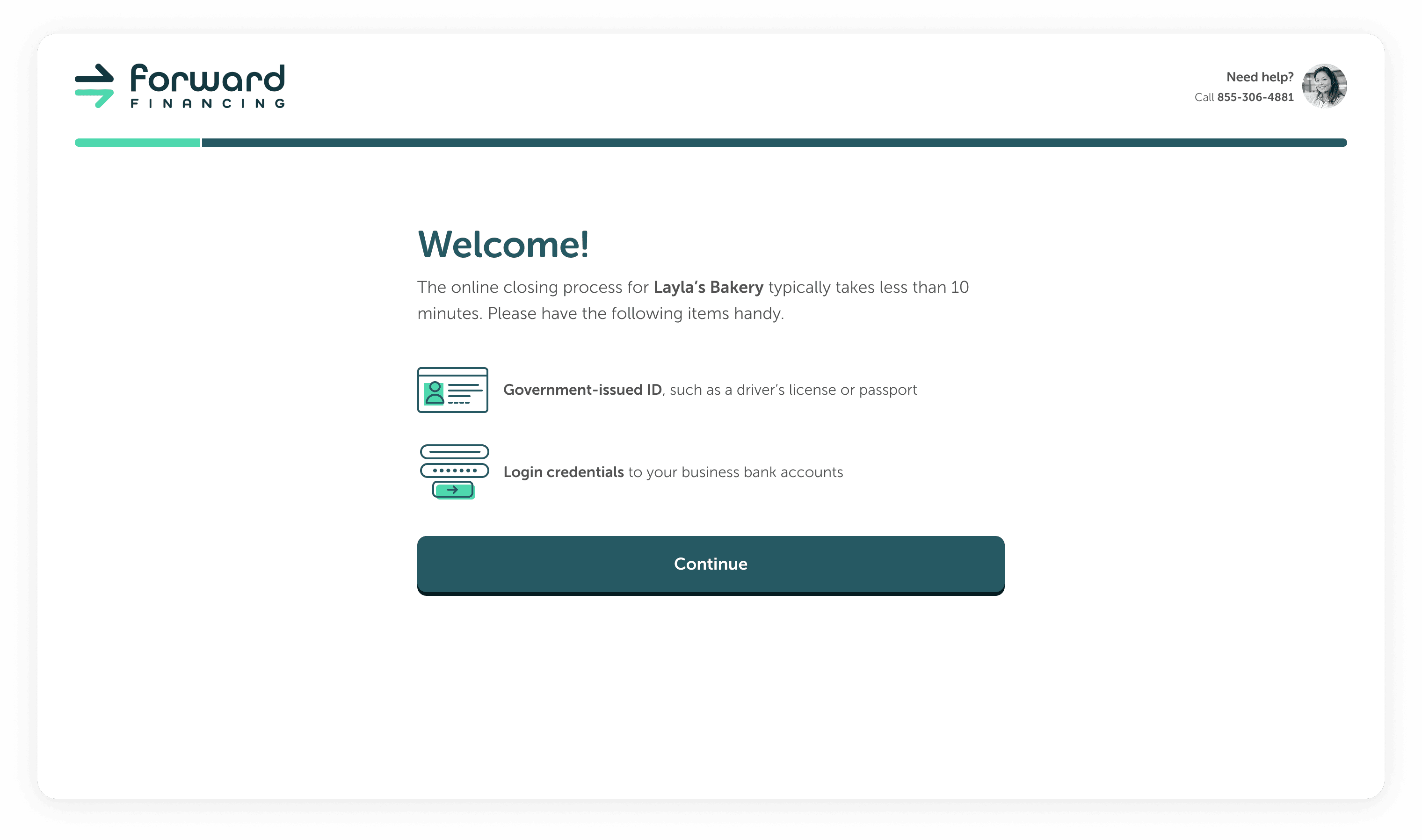
After accepting offers, SMB owners complete a 15-40 minute funding call with Forward's Dominican Republic-based team, submitting personal and business documentation. The process faced inefficiencies as business owners were often unavailable or lacked required documents like driver's licenses or bank statements, causing frustration for the Funding Team and lost financing opportunities.
Activities
Prototyping, UX Design, UI Design, User Interviews, Rapid Iteration, Stakeholder Management, Typography Refinement, Component Creation
Timeline
2 months
Team
Courtney Sabo (Solo Designer)
Lauren Beaudry (Product Management)
Company Type
Financial Services
B2B
200-500 employees
We quickly refined the proposed flow and created an initial prototype.
While we sought flow approval from leadership, I created an initial prototype of the experience, refining styles from a recent rebrand.
I worked closely with the Marketing Team, who had outlined an initial process, and a PM, who ultimately took over ownership of the process. While we knew all the steps needed in the process, most of the discussions involved the order of these steps.
Flow updates: Originally, we first asked for Eligibility and Identify information, then moved to bank verification since that grouped together similar data for users. Basic information needed to come first to prevent fraudulent users, and bank verification ultimately needed to come immediately after so backend checks could run in the background while the user completed the flow.

Some screens from the initial prototype: We utilized Forward’s marketing design system within the platform — this was important for the Marketing Team. We updated the colors and typography sizes to ensure AAA accessibility.
Each week, we coralled stakeholders to gain approval for new changes.
This was a huge project for the company that would cause process changes across the organization. Each week, we walked through the flow to highlight recent changes and seek approval from all stakeholder groups, including Marketing, Product, Legal, Engineering, Funding Team, Sales, and Leadership.

Screenshot of Figma: This Figma file was iterated on daily and reviewed weekly with the stakeholders.
SMB owners gave overwhelmingly positive feedback about the experience during usability testing.
I crafted and executed a research plan with 10 SMB owners who fit Forward's target audience. In each session, the SMB owner walked through the prototype, answering my questions about what they were seeing and acknowledging anything that confused them.
Prototype: SMB owners walked through this Figma prototype during a 60-minute usability testing session.

User findings presented to leadership: User testing revealed overwhelmingly positive feedback (4.88/5) for the online process, with all participants preferring laptops over phones. Main concerns included confusion about Forward's role, desire for earlier deal information, and redundant verification steps. Plaid integration was well-received, contrary to expectations.
Over 6 months, we continued to refine and decrease the scope of the MVP.
Product, Engineering, and Design worked closely together to decrease scope and finalize the flow based on third-party vendors for fraud checks, identity verification, and bank verification.

Removal of ISO selection in email: In the user testing, all participants were confused about the terminology of “ISO” (AKA broker) and how those organizations related to Forward. Allowing the SMB owner to select this was posing technological and business complexities, so we removed the ISO selection part of the process entirely.

Removal of ISO selection in flow: This decision simplified the first few screens the user sees.

Simplified authentication: We needed SMB owners to sign up with their email address on file, which complicated SSO. Additionally, implementing SSO was going to add to the timeline, so we removed all SSO and disabled the email address field to ensure the SMB owner signs up without error.
Responsiveness: As the MVP was nearing approval, I translated all mobile designs to tablet and desktop, an easy process due to the low information density.

Design love for Funding Overview: This screen was the biggest improvement and the most “designed” — this information was previously presented as paragraphs of text. During user testing, 5 of the 8 participants mentioned they loved the readability of this screen.
Interested in working together?
© Courtney Sabo, 2025