
DentaQuest: Provider Portal
Product redesign of DentaQuest’s portal that allows dental administrators to check patient eligibility, manage referrals, and file claims
Product Design
User Research
User Testing
Product Management
DentaQuest is one of the largest dental insurance companies in the United States, offering Medicaid and CHIP, commercial, direct-to-consumer, and marketplace dental programs to nearly 30 million people across the country.
DentaQuest's internal development team had recently built and released new portals that were poorly received by users. The websites suffered from slow load times, broken functionality, and unintuitive interfaces. Dental office administrators and patients were frustrated by basic tasks that should have been simple.
DentaQuest was at risk of losing their largest client, Texas Department of Health and Human Services, who contracted with them for Medicaid benefits.
Activities
UX Design, UI Design, User Interviews, Stakeholder Management, Prototyping
Timeline
6 months
Team
Courtney Sabo (Lead Designer)
Matt Morosky (UX Design)
Tammy Chang (Designer)
Company Type
Healthcare
Government
1000-5000 employees
In-depth portal analysis revealed critical usability issues among dental admins.
User research with 16 dental administrators revealed critical pain points: frustration with generic error messages, lost form data requiring re-entry, excessive clicks for routine tasks, and security concerns with shared login credentials.
I worked closely with DentaQuest's technical lead to comprehensively understand the existing portals over two weeks.
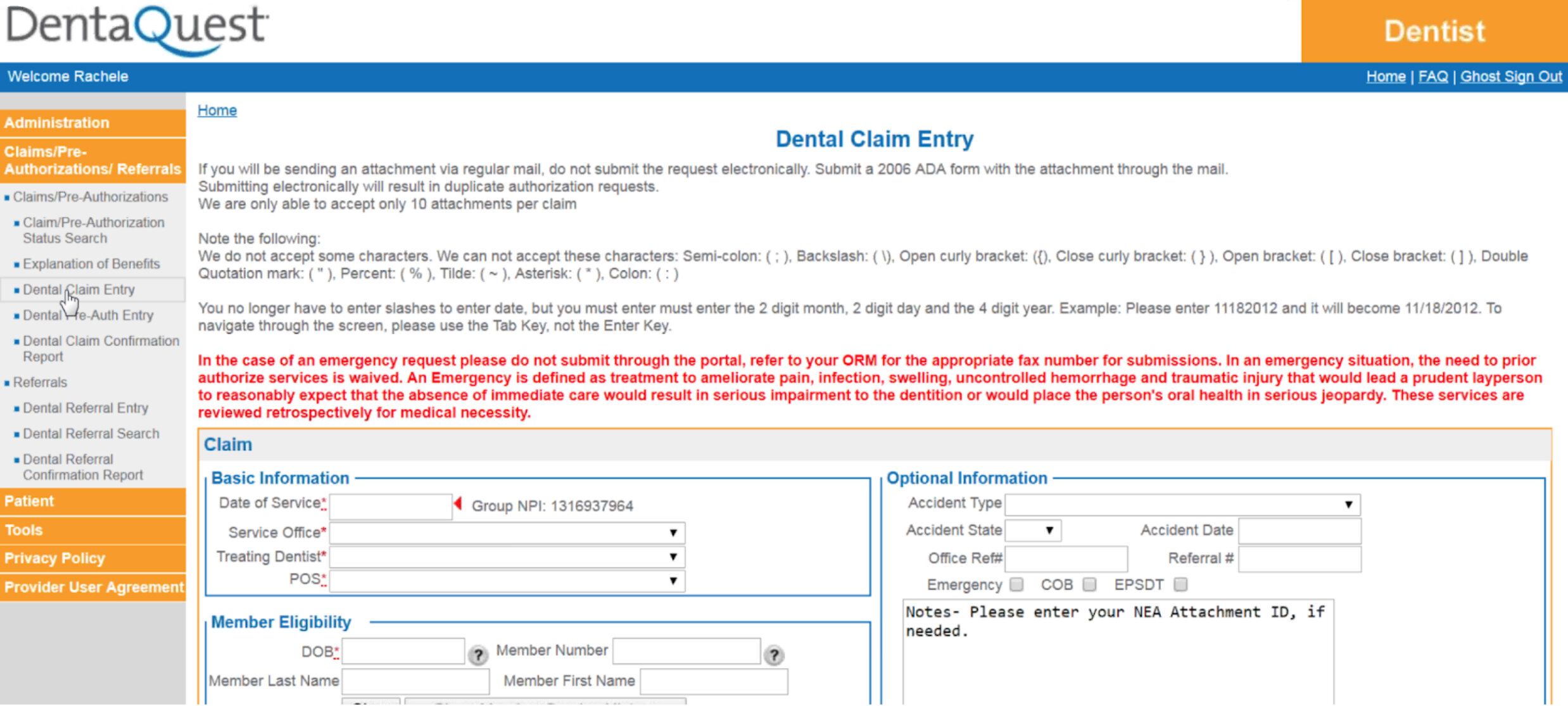
Existing design: The original portal left providers frustrated, not only with the visually challenging interface, but with the number of technical issues faced when trying to enter claims.
Collaborative workshops aligned diverse stakeholders to address significant portal usability challenges.
We structured the complex project into eight design sprints per portal, focusing on major workflows (eligibility checks, claims, referrals) that presented UX challenges for Spanish-speaking users and those with limited technology access.
I coordinated between 16 DentaQuest stakeholders, a third-party technical team, and Texas DHHS through facilitated workshops that clarified roles, prioritized user flows, and created a shared vision.
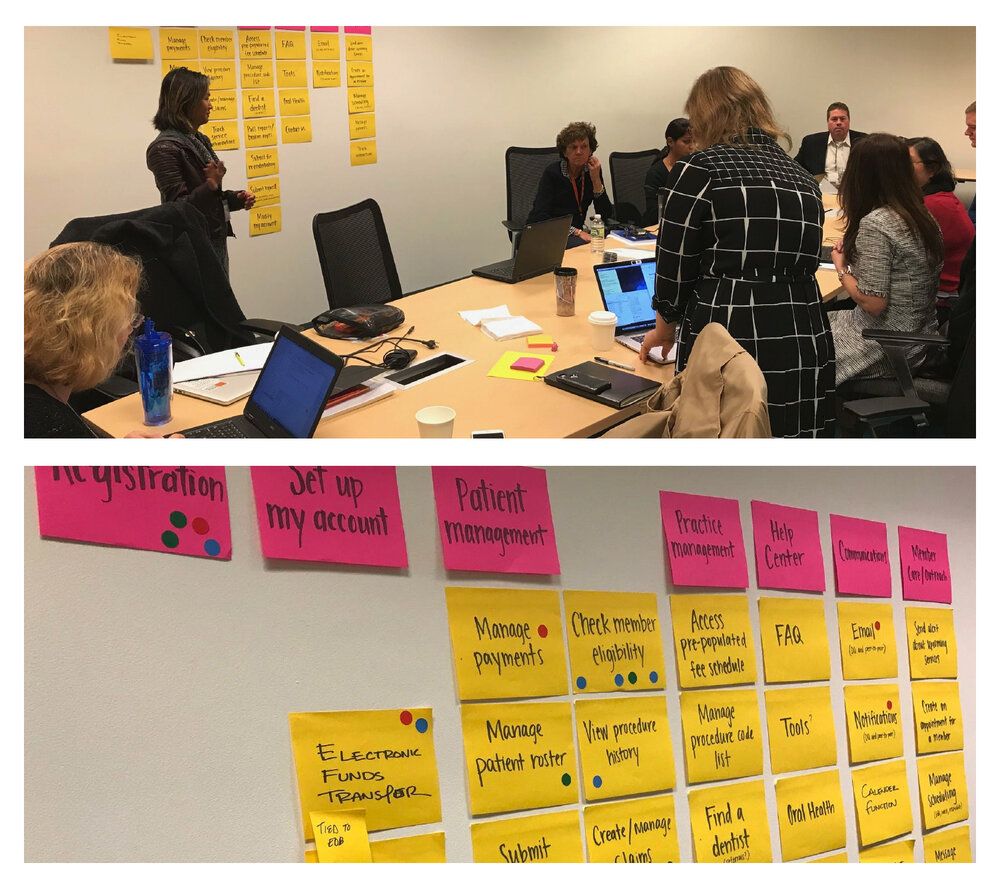
Workshop facilitation: We used dot voting exercises to gather and prioritize requirements from all stakeholders.
Dynamic information architecture evolved through iterative user discovery and testing
Early in the project, we developed a comprehensive sitemap that established critical relationships between key portal sections. This foundational architecture continuously evolved throughout our UX sprints as we conducted user testing sessions and synthesized feedback patterns.

Information architecture (IA) diagram: The sitemap showing the hierarchical structure and interconnected relationships between main functional areas including Claims, Profile, Authorization & Referrals, Network, and Payments sections.
Transforming frustrating errors into helpful guidance systems
One of the biggest user pain points was generic error messages causing data loss after completing lengthy forms. Working closely with developers, we redesigned the error handling system to include contextual messaging, clear guidance for resolution, and subtle visual indicators that highlighted issues without overwhelming users—dramatically reducing task abandonment rates.
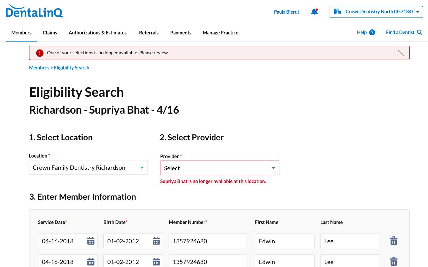
Form error states (wireframe): We designed and wrote copy for error states that appeared in-line and with fields for every form on the portal.
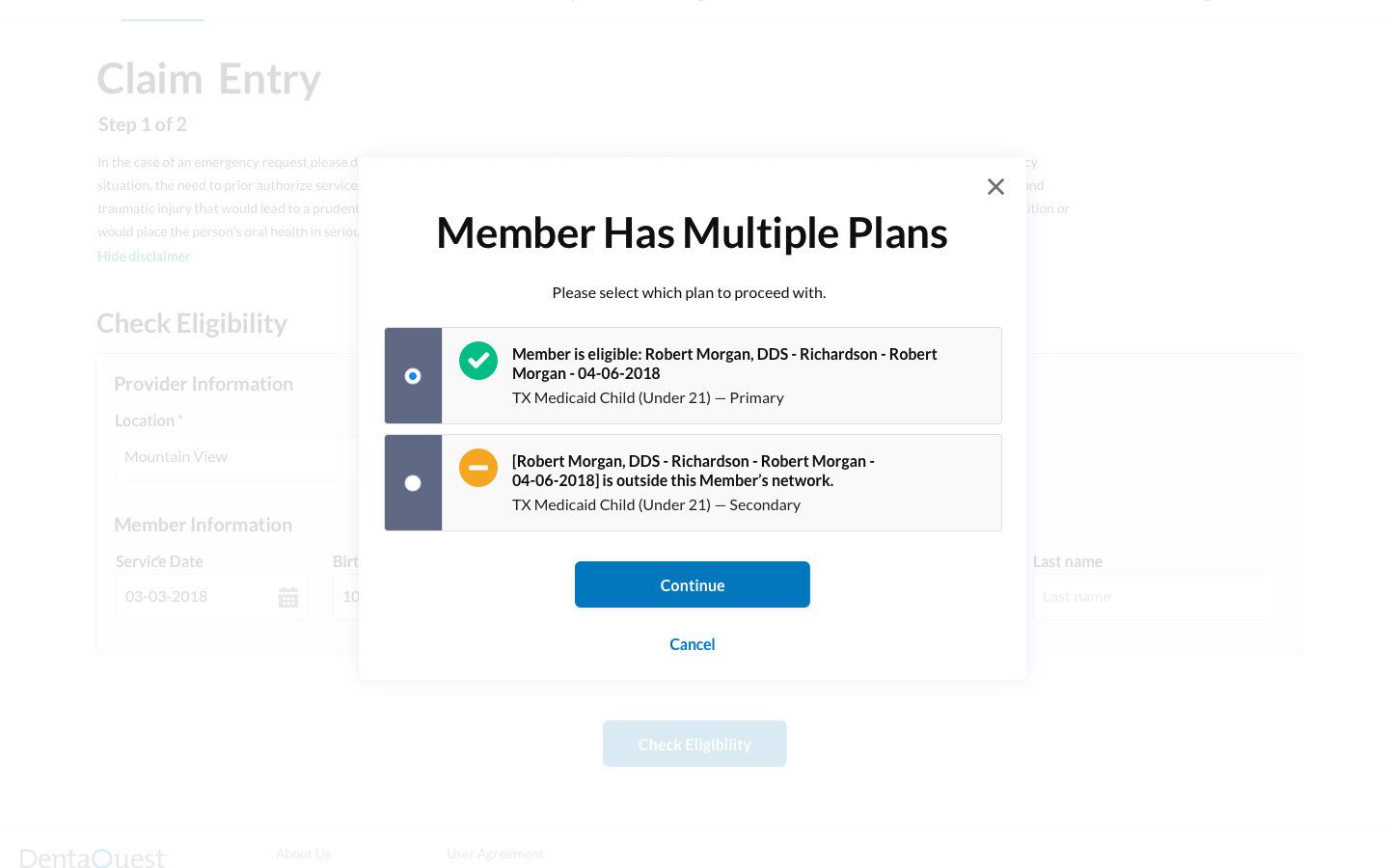
Dialog requesting action (wireframe): For complex scenarios where users might have multiple eligibility plans or coverage options, I designed dialogs that provided clear choices and explanations rather than cryptic error messages. This transformed moments of friction into guided experiences that helped users complete their tasks successfully.
Thoughtful UX design improved HIPAA compliance while enhancing user experience.
Our research revealed widespread credential sharing in dental offices, creating significant HIPAA compliance risks. Rather than merely enforcing stricter rules, we designed systems that made security compliance the easiest path through streamlined registration, personalized user experiences, and granular permission management.

Simplified registration process (wireframes): The redesigned registration flow reduced complexity from a multi-page form to a streamlined two-step process with email verification, dramatically lowering barriers to individual account creation.

Granular permission management (wireframe): We restructured user management with easy-to-understand permission levels based on common tasks and office departments, implementing "super user" roles that provided practice oversight while maintaining proper access controls.
Comprehensive usability testing revealed and solved persistent workflow challenges.
We conducted extensive usability testing with over 30 participants across multiple rounds to optimize UX flows before proceeding to visual design. Through both in-person and screen-sharing sessions, we identified and addressed key pain points in high-frequency tasks.
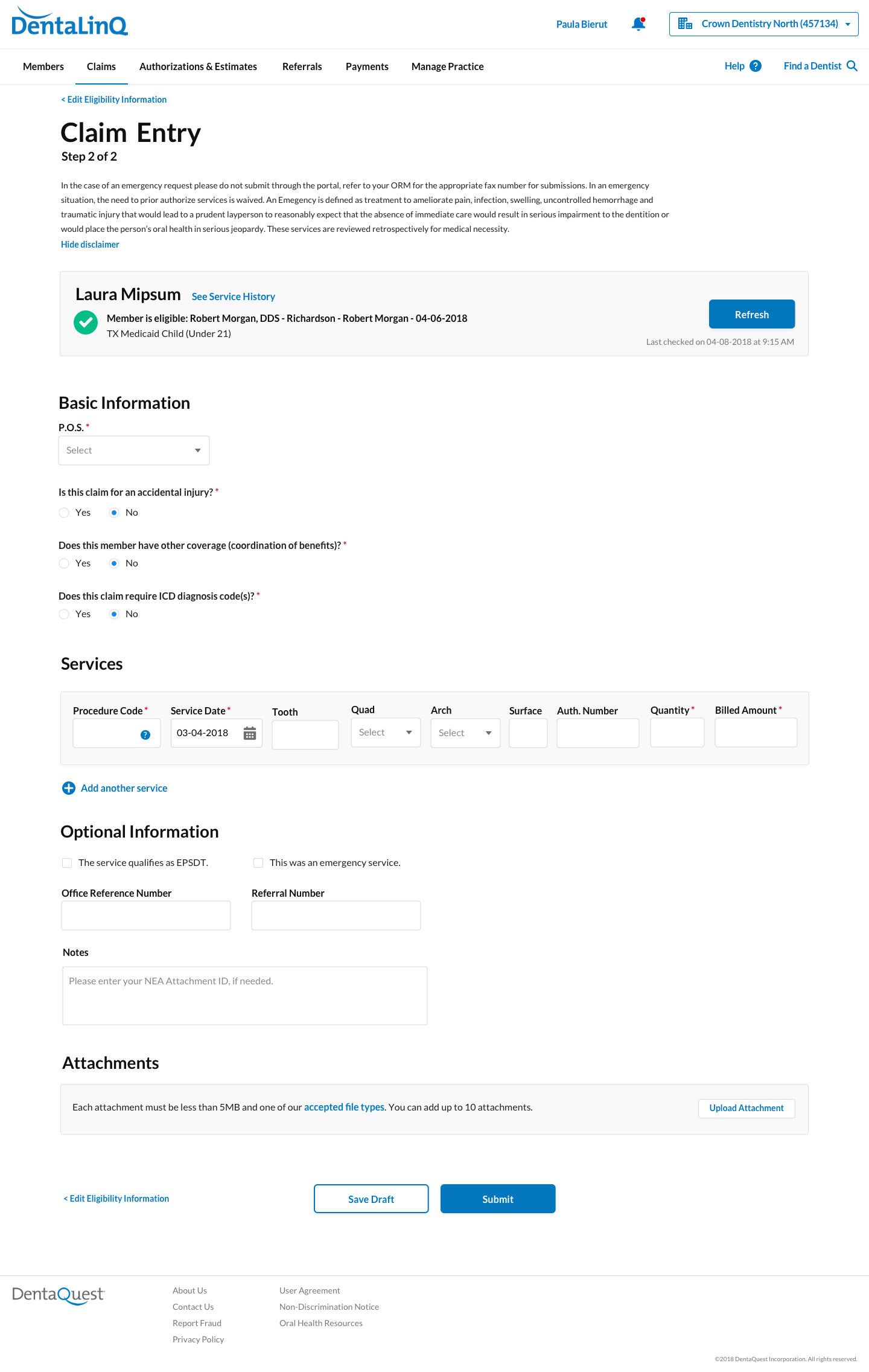
File a claim flow (wireframes): We focused heavily on claims processing because dental administrators perform claims filing dozens of times daily, making every click significant. We restructured forms to match natural workflow sequences, added quick-access availability views, and implemented full keyboard navigation—reducing process time by eliminating unnecessary interactions.
Our team created a practical design system that successfully balanced technical limitations with user needs.
Our 100+ page handoff documentation ensured seamless implementation with detailed style guides, annotated designs covering 8 functional areas, and flows for 25+ user journeys—enabling development teams to implement designs faithfully without ongoing support.
We developed a visual system with Texas HHS featuring clean layouts and blue interactive elements while adapting to Salesforce platform constraints. Our approach maintained accessibility standards while balancing DentaQuest's brand identity with government healthcare credibility requirements.

Homepage: We added a personalized welcome message to the screen, further encouraging admins to create their own accounts. Simplicity became a strength of the final product, allowing users to quickly jump into actions.
Patient detail pages: We highlighted the most important actions and information above the fold.
Claim detail page: We utilized clear type hierarchy on claim pages, the most information-dense part of the website.


Developer handoff: The third-party developers didn't work in any design software, so all designs and style documentation were handed off via PDFs.
Interested in working together?
© Courtney Sabo, 2025